If you have arrived at this article I can only assume the burning question on your lips is “What is responsive webdesign?” well put simply responsive web design is an approach undertaken by website designers and developers to build a website or page to make them “respond to” and “automatically resize” content depending on the size and orientation of a device or the size of web browser window on a larger device such as a laptop or PC.
The goal of having a responsive website is to ensure any one visiting your website is able to interact, read and navigate it easily this is done by building the website in such a way that the elements on your page respond to how your device works but also re-size these elements to fit nicely on the screen.
In other words a website that has been designed and developed to be responsive will resize its content to fit the screen but also make decisions based on what not to display based on the size of device… for example on a mobile phone you may hide elements that are too large to be displayed nicely such as larger graphics, videos or more fancy elements that take up a lot of room however on larger devices like a laptop these elements make the page look good so they will be displayed.
A responsive website gives you a platform to display the content of your website in such a way that anyone visiting your website will be able to easily tell what your website is about, able to read your content, before responsive websites you had the choice of either creating an app or mobile specific website that ran along side your main (desktop website) or make people viewing your website on smaller devices put up with either your website scaling down making it hard to read and use.
Imagine your contact form has a button that on a desk top screen is 2cm high which is a pretty reasonable size however when scaled down to a screen that is 1/8th of the size that button is now less then 3mm high trying to press this with your finger is very hard and on some devices almost impossible, on a responsive website this button would scale up to be big enough for visitors to easily click it.
With more and more people using their mobile phone as their primary or even sole method of accessing the internet this is essentially stopping any of these individuals from being able to submit this form and would result in a loss of customers.
Also with search engines now indexing websites mobile first not having a responsive website means that when people on a mobile phone search for products you sell the websites that are responsive will appear above you in the listing but this is a different conversation of which you can read more about here.
Things that work on desktop browsers are not always great on mobile devices for example on most websites you would have a menu along the top with several links and or menus displayed horizontally along the top now this works great for desktop and laptops but on smaller tablets and mobile devices there just isn’t enough width to display a full width menu.

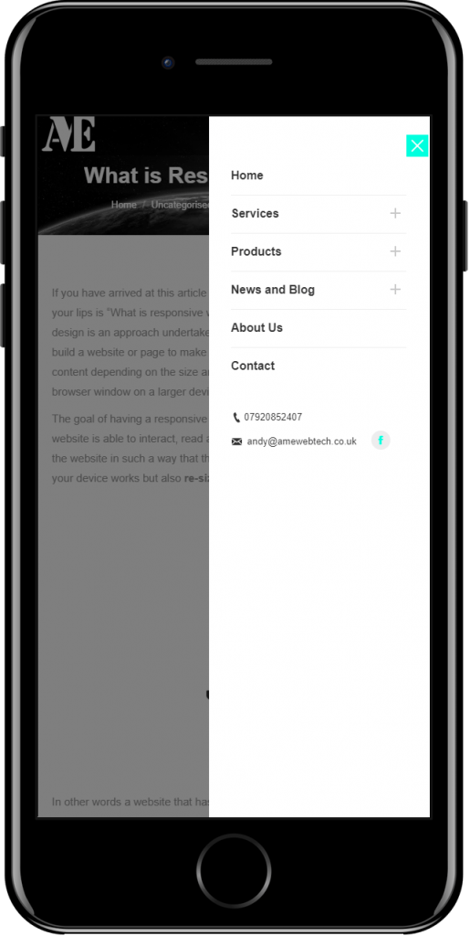
To get around this a responsive website would have a different menu specifically designed for smaller screen sizes, quite often hiding the bulk or the entire menu of the menu from view until a button is clicked which triggers the menu to appear. Often the “hamburger” icon is used on a button to open the menu.
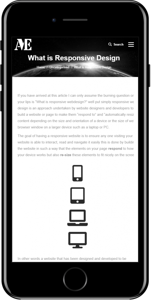
The below 2 images demonstrate this, the first shows the website being viewed on a mobile phone in the top right hand menu you can see the hamburger icon, when a visitor clicks on it they will be presented with the menu containing the same information as they would see if they where to view the website on a desktop PC but displayed using a different menu specifically designed for smaller screen sizes.


This is but one example of how websites need to respond to different devices and their screen sizes, this means your website visitors will be able to navigate your website easily and are less likely to get fed up trying to get between pages and just go back to google to find another company who’s website they can navigate (remember people visiting websites have short attention spans.)
The second function of a responsive website is to ensure all your content fits in to the screen or web browser window, this is a bit more complicated in that you don’t want to create a mobile version of every page component, instead the content of your website is divided up in to columns for example if you have a blog when viewing an article you may have (like this page) a large area on the left that is about 80% the width of the page and a menu to the right that is 20% the width of the screen.
As screen sizes start to get smaller each of these columns retains there proportional width until such a point where one or both of them starts looking messy at which point you make both columns 100% width forcing the second column to drop below the first column essentially making them appear in separate rows.
This means that you are making more of the screen width on smaller devices and making your content easier to read.
Indeed if you are viewing this page on a desktop device you will see both the side menu and content side by side, if you where to reduce the size of your browser window or open this page on a mobile phone you will notice you need to scroll all the way to the bottom of this page to see the menu that currently displays on the left hand side.
Why Responsive Design
Responsive websites are a reality and not having one could mean that a large percentage of your potential website visitors will not find you on line, it also offers a greater level of accessibility and usability making your website more attractive, appealing and have notably bigger impact on your visitors increasing the chances of visitors to your website becoming customers.


